Here is a selection of my work from 2009 - 2011, if you would like to see my full portfolio please e-mail me [email protected]
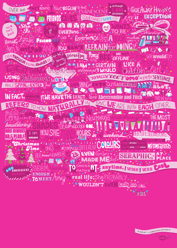
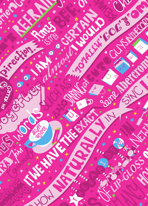
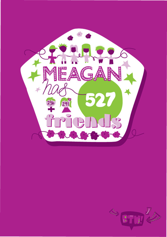
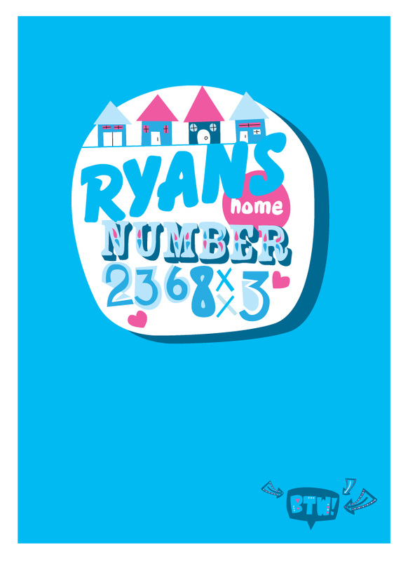
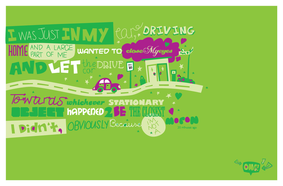
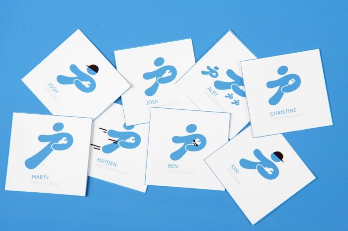
Who Are Your Friends?
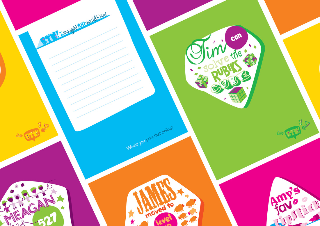
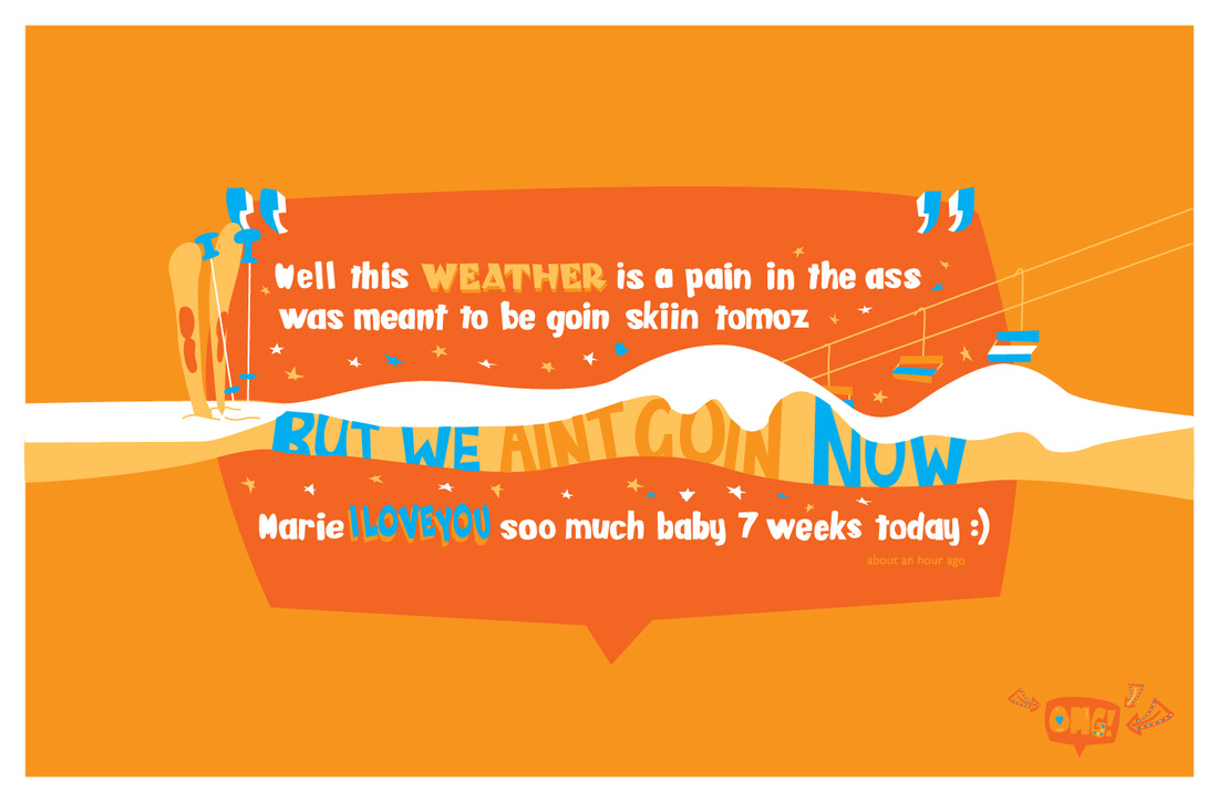
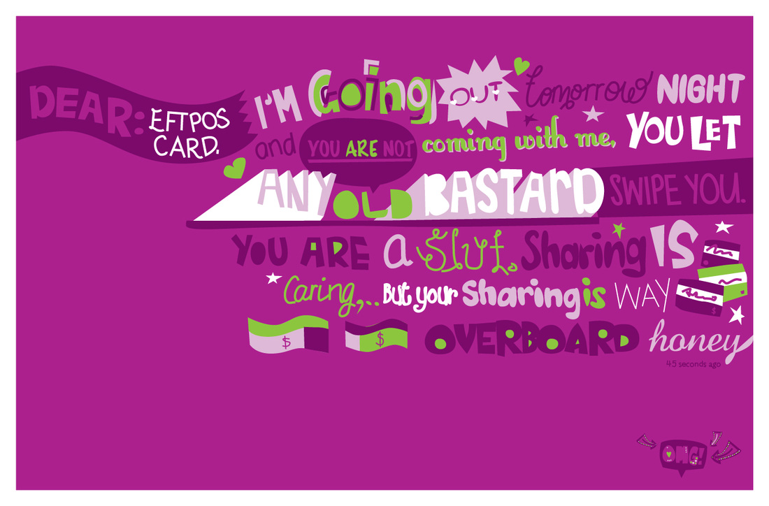
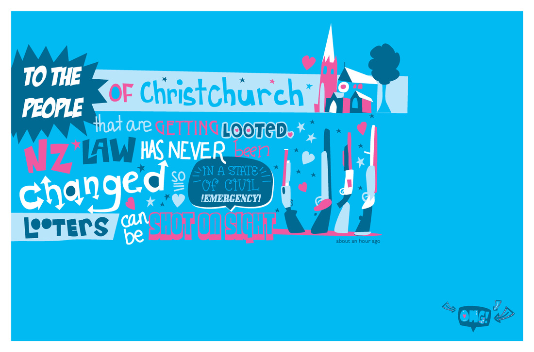
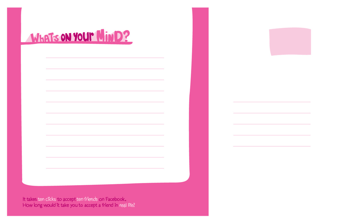
My main research project for my final year at university focused
on the effect of micro blogging and 'friendship' on Facebook.
My project consisted of a sequential campaign that began
by requesting the friendship of strangers on Facebook. Then I
used their information in my designs, ultimately exploring
ways to entice users to be aware how and with whom, they are
sharing information online. I used six peoples information for
the final designs, each character has their own colour to make
identification for viewers easier. The campaign was set in three
stages; notecards, postcards and finally large A0 posters.
My full designer statement can be downloaded below.
Click on image to enlarge.
Click here for the full range of work on this project.
| statement_2010.docx |
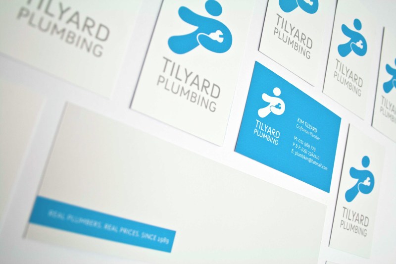
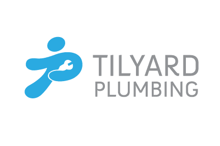
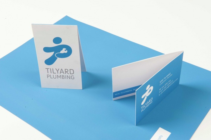
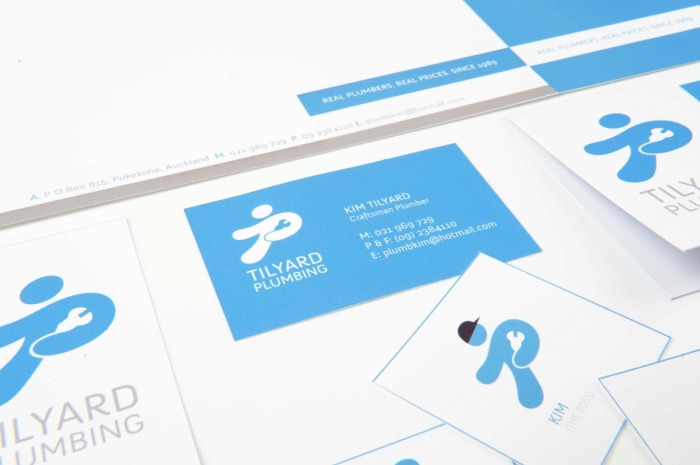
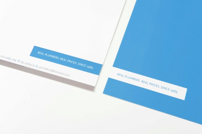
Tilyard Plumbing
The identity of Tilyard Plumbing needed to communicate the
core values of a trustworthy, professional and approachable
family business, which offers quality service and a willingness
to get things done. The main letters ‘T’ and ‘P’ have been used
to create a design for an abstract figure that has an energy
and excitement about it. It allows the personable nature of
the company to be brought to the attention of the viewer while
still upholding the core values of competence, professionalism
and approachability.
This project was created in 2010 as a freelance design project.
Click on image to enlarge.
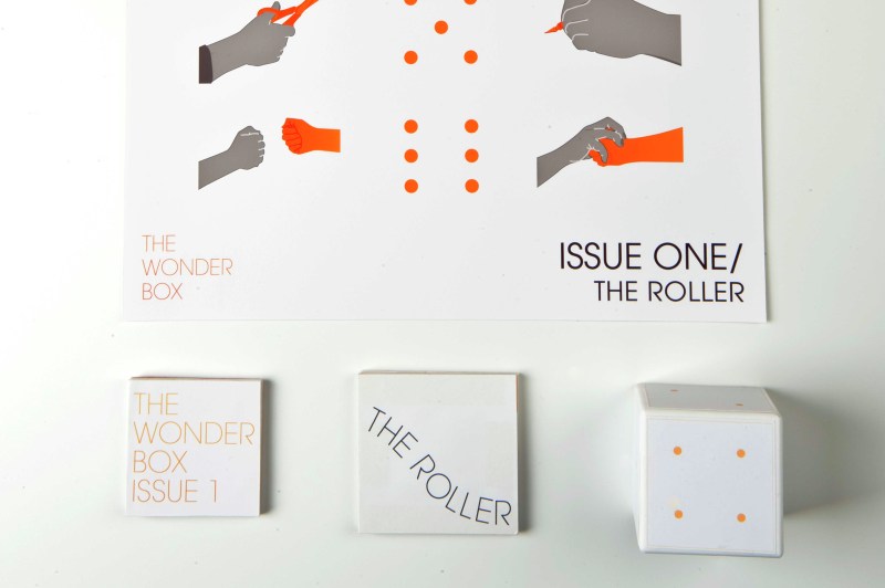
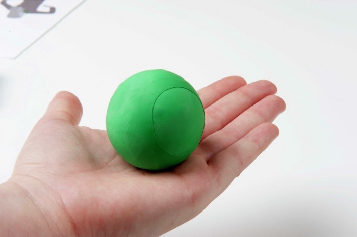
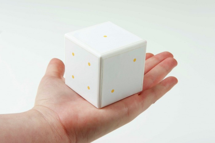
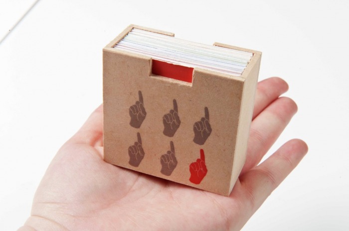
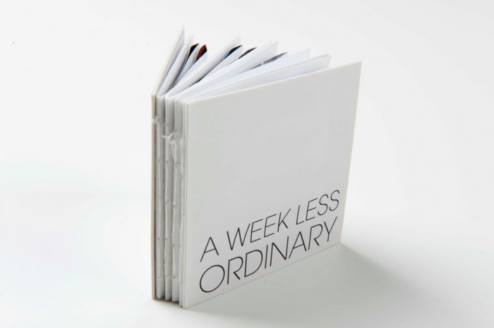
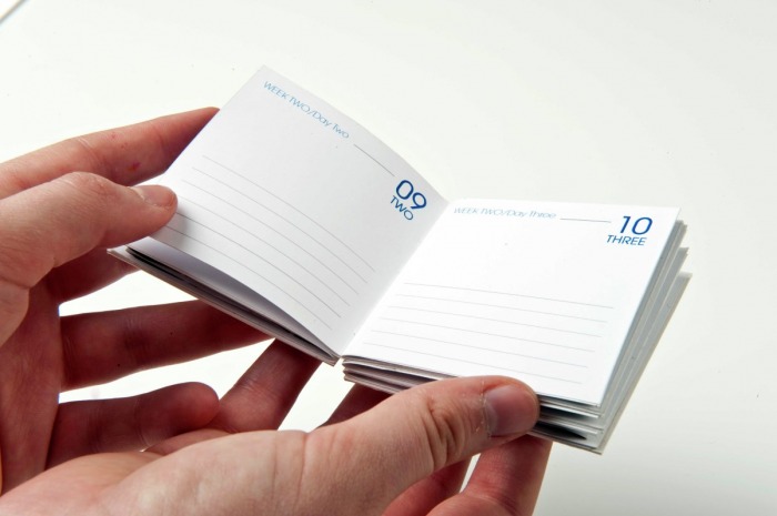
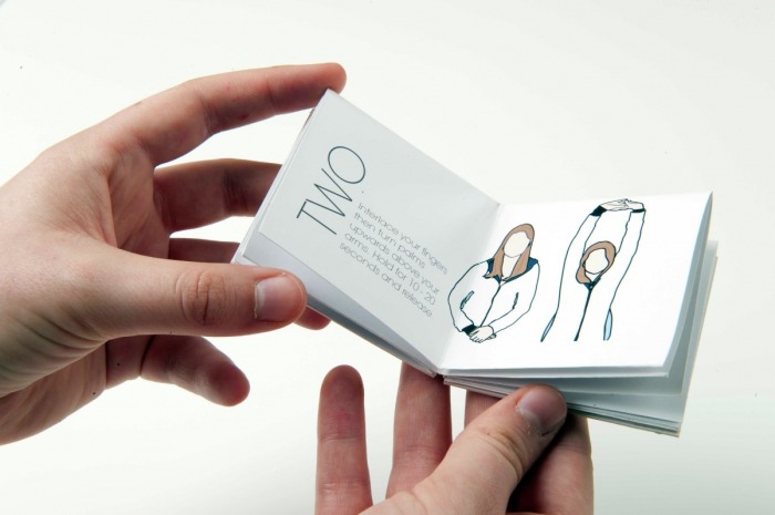
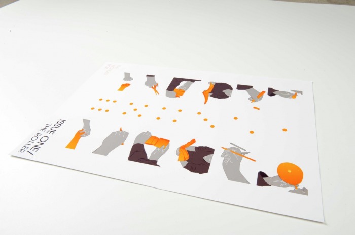
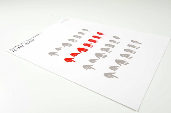
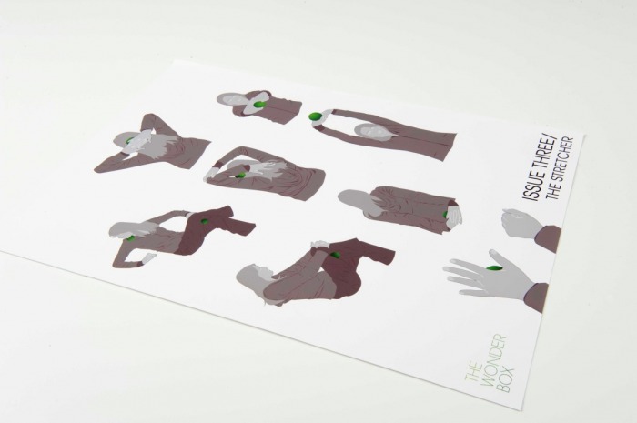
The Wonder Box
The Wonder Box is a publication aimed at design students
that explores the concept and potential of giving design.
It looks at the result of allowing the mix of chance, systems
and rules aid the designer’s creative process. The publication
consists of three issues; The first issue 'The Roller' explores
the idea of allowing a set of predetermined rules decide
directions for design work. The second issue 'A Week Less
Ordinary' explores the idea of allowing outside influences
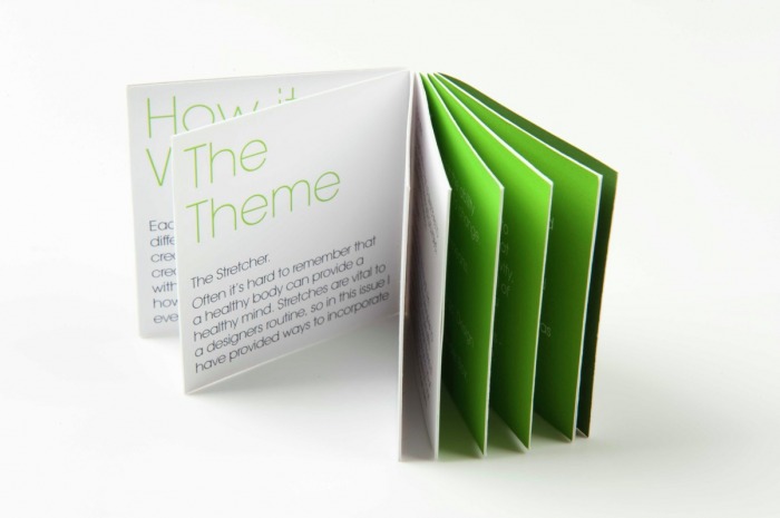
inspire the creative process, and the third 'The Stretcher'
explores creative ways to include stretches in everyday life.
Each issue comes in a small box; inside are two booklets, a
foldout A2 poster, and an object. The objects are hand made
and the booklets are hand bound in order to reinforce and
encourage a hands-on interaction with the publication.
This project was created in 2009 as my studio research project.
Click on image to enlarge.
that explores the concept and potential of giving design.
It looks at the result of allowing the mix of chance, systems
and rules aid the designer’s creative process. The publication
consists of three issues; The first issue 'The Roller' explores
the idea of allowing a set of predetermined rules decide
directions for design work. The second issue 'A Week Less
Ordinary' explores the idea of allowing outside influences
inspire the creative process, and the third 'The Stretcher'
explores creative ways to include stretches in everyday life.
Each issue comes in a small box; inside are two booklets, a
foldout A2 poster, and an object. The objects are hand made
and the booklets are hand bound in order to reinforce and
encourage a hands-on interaction with the publication.
This project was created in 2009 as my studio research project.
Click on image to enlarge.
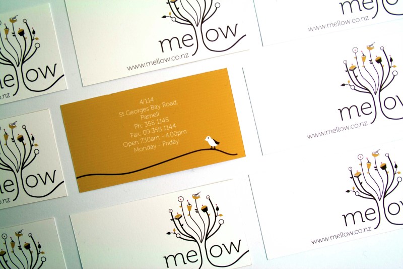
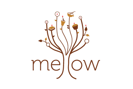
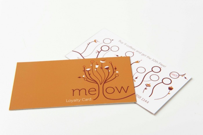
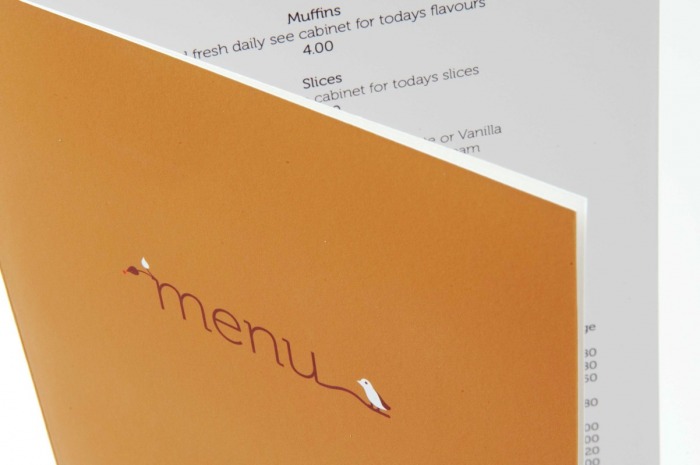
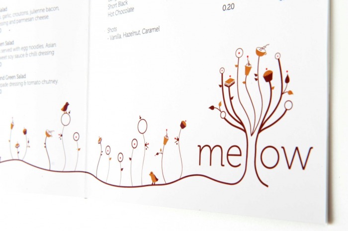
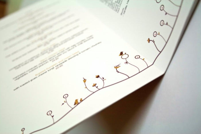
Mellow Cafe
The Mellow Cafe is a re-brand of a corporate identity design
for a cafe that reflects the idea of growth in a business and
a company that offers fresh and honest food. I developed
the concept of a tree as being best suited to convey the
central themes. The connotations of growth and freshness
are clear and naturally imply the concept food ‘picked straight
from the tree’. It was important to the client the design reflect
something unique and friendly which is represented in the
illustration style.
This project was created in 2010 as a folio brief.
Click on image to enlarge.
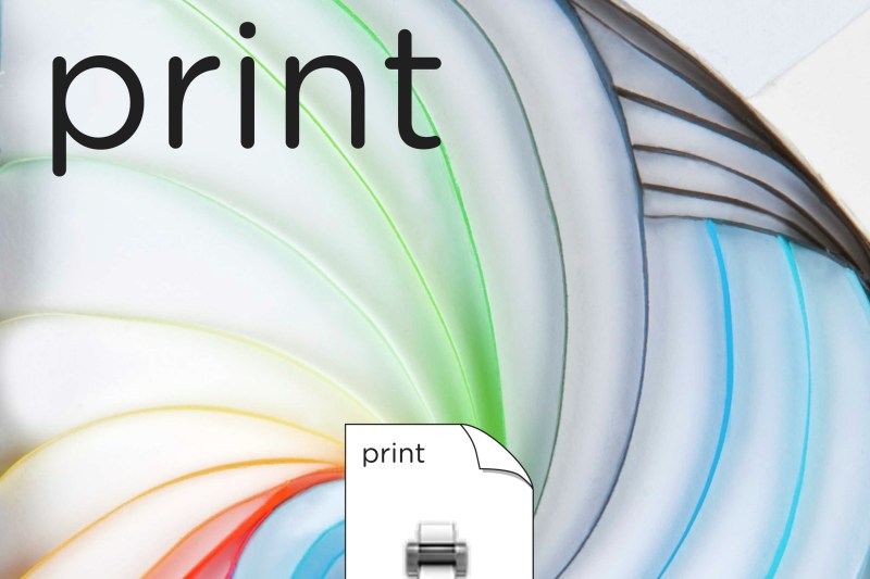
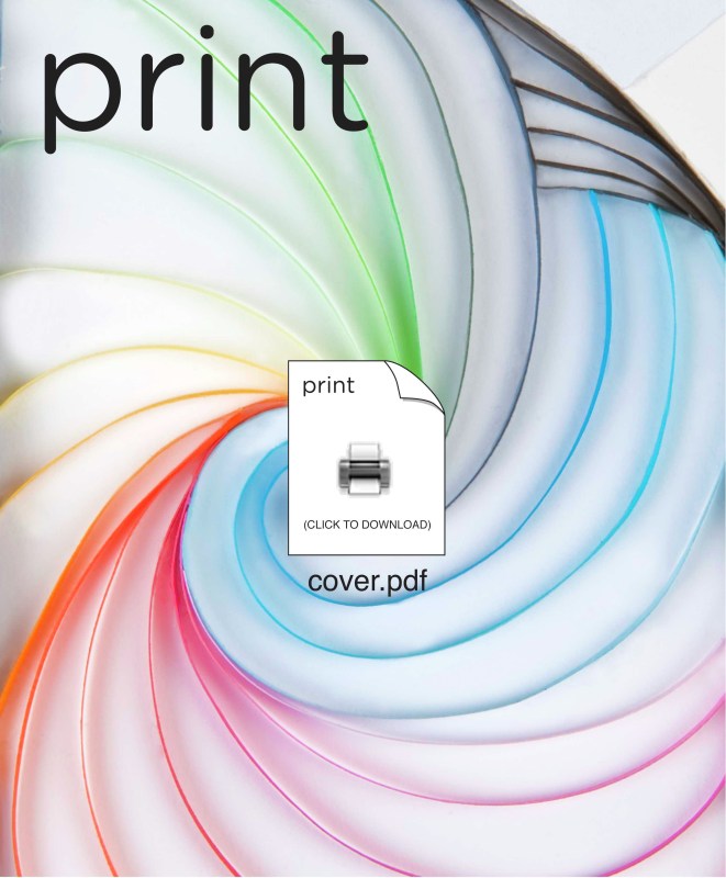
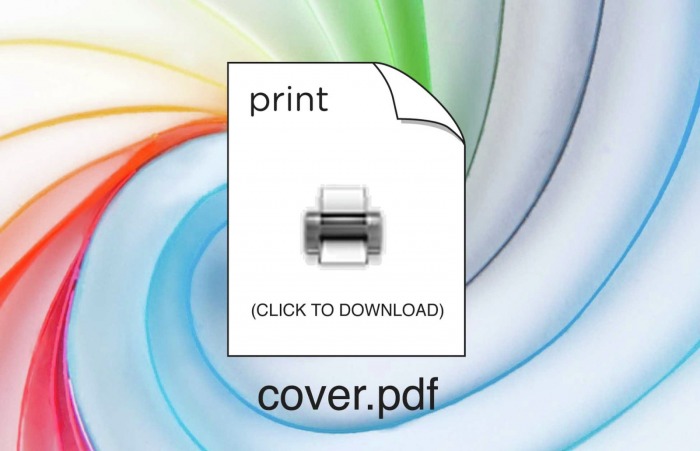
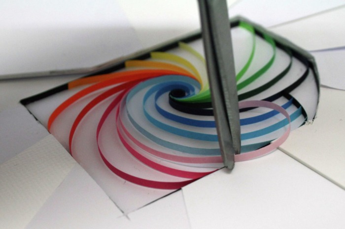
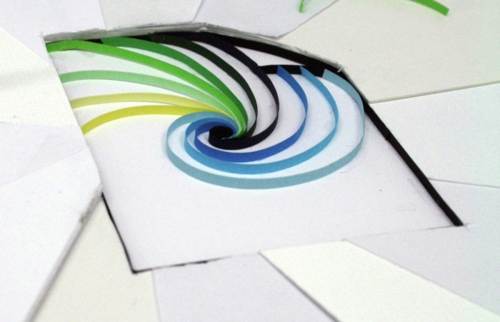
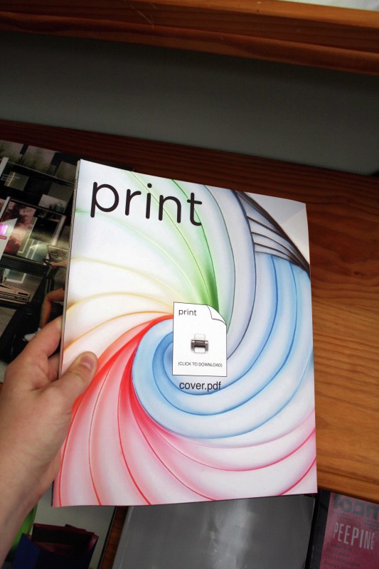
Print Magazine
Print Magazine is a live annual design competition. This year
the theme was to consider the question “What is the Future
of Print?” My concept deals with the idea that if magazines
stop being printed, to view a cover, you will have to download
it and print it yourself. My concept addresses the reality of print
being an interactive, tangible experience. I use a plain icon in
the center of my cover to show that you cannot interact with an
icon outside of a computer. My concept suggests that, through
print, we are able to hold, touch and feel the impacts of graphic
design. The work is made mostly through paper quilling.
This project was created in 2010 as an international competition brief.
Click on image to enlarge.
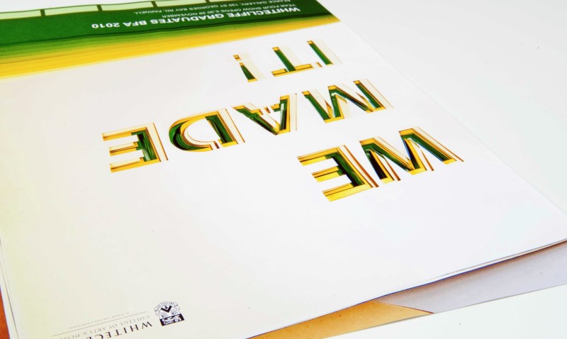
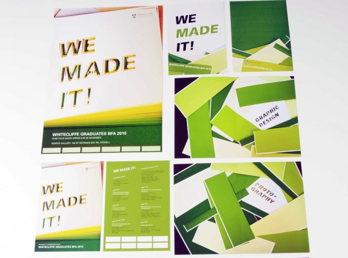
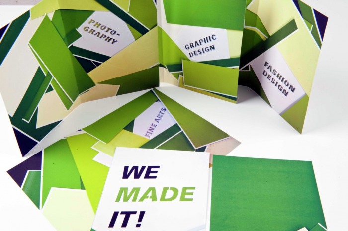
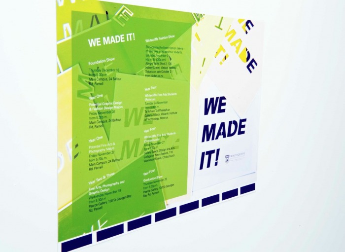
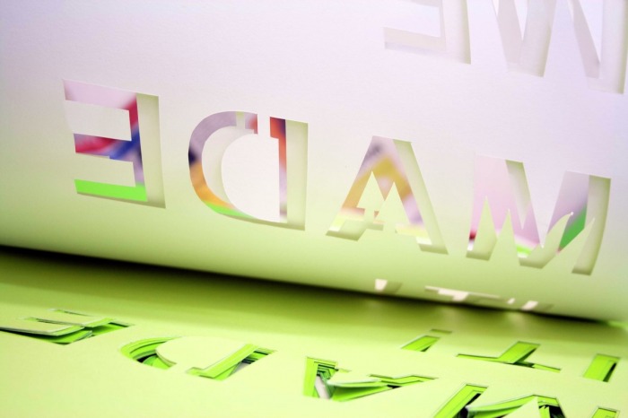
We Made it!
A series of promotional items to promote the Whitecliffe Graduate
Exhibitions for 2010. For the project I came up with the title “We
Made It”. This illustrates the concept of the students making it to
the end of the year and making the work in the exhibitions. I cut
into several layers of paper to exemplify the intense focus and
time consuming process of completing a degree. The hands on
approach of the school and the idea of a friendlier more tactile
feel was something I wanted to communicate through my design.
The concept has been applied to five main pieces. A poster, an
invite, an email invite, a catalogue cover and four department breaks.
This project was created in 2010 as an in-house competition brief.
Click on image to enlarge.

CONTENT COPYRIGHT SAMANTHA TILYARD. ALL RIGHTS RESERVED. NO PART OF
THIS WEBSITE OR ITS CONTENTS MAY BE USED OR REPRODUCED WITHOUT PERMISSION.
